


This year is in full swing and every year design trends change a bit. Trends don’t always mean “new” as you have probably seen these elements incorporated into our websites throughout 2015, but there are differences and improvements to be made this year.
 First things first, mobile.
 First things first, mobile.
Mobile website design, or responsive web design is nothing new. Throughout the past few years, there has been a shift towards more mobile web browsing, which is why this trend is arguably most important. The mobile-first design technique means that designers have to be thinking ahead to how a website is going to re-format to fit tablet or phone screens. You’ve probably seen these letters floating around out there if you keep up with website design: UX and UI. They refer to how a user is navigating through your website and their experience in doing so. Mobile website design has standards just like website design for a desktop computer, the standards all add to the user’s experience when browsing through a mobile site.
More hamburgers! …and icons
Why are you using hamburgers to design websites? …the hamburger is the mobile “Menu” icon that you are seeing more and more. Three stacked lines – that coincidentally resemble a hamburger. This icon is becoming a universal symbol for navigation and for your users to find what they are looking for on your website.
 Okay... so everyone loves hamburgers, but what’s so great about icons?
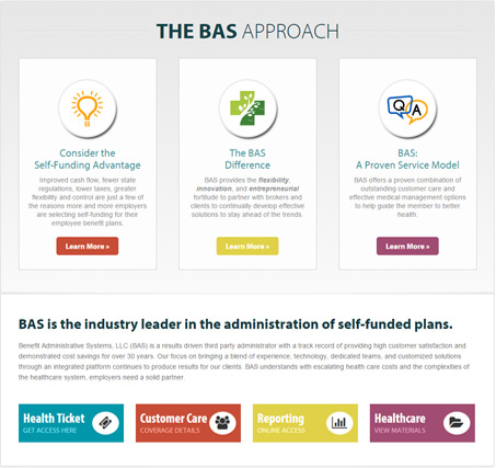 Okay... so everyone loves hamburgers, but what’s so great about icons?
Icons are great because this allows visitors to skim your website quickly to find what they are looking for. Reading is work but looking at pictures is fun for most website visitors. Icons also add an element of design to text that might have looked a little dull otherwise. The changes that we’ve seen in the past few years have also made it easier for designers to use icons. Our resources have been totally upgraded. We can now use SVG icons – which look great no matter what size they need to scale to. Font Awesome is another one of our resources that makes it super quick and simple to drop icons into our sites.
 The long scroll layout
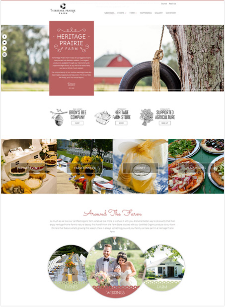 The long scroll layout
At VisionFriendly, we’ve seen some differing opinions about this concept. More and more website visitors are getting used to the long-scroll thanks to social media websites such as Pinterest and Facebook that incorporate the “infinite scroll” method. This is where users can continue scrolling for what seems like forever to keep seeing more and more information. Long scroll is fun for designers because we can incorporate a bunch of different design elements into a site that help to tell a story about the company. The long-scroll is a concept for the future. While we continue to keep the most important information at the top of the home page or above the fold, some of the more interactive elements can be found as you continue moving down the page.
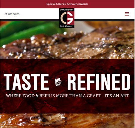
Less text & more photos
Photos have always been used throughout websites to capture and keep the visitors attention. This year, we’re trying to find ways to incorporate more and more photos than ever before. While keeping a certain amount of text on a page is important for SEO purposes, visitors LOVE to see pictures. Photos help tell a story and give a website the overall “feel” for a company, their services and how they operate.
CSS3 & JQuery animations
Animations, whether big or small, can make a huge impact on a website. Animations add an extra element of interest, can be used to draw attention to certain points on a website, and create some interactivity between the website and the end-user. There are generally three different types of animations that can be used throughout website, large scale, small scale and loading animation. Large scale animations includes the popular effect, parallax scrolling. Small scale animations don’t require an input from the visitors, though can be controlled by the user’s interaction with the website such as hover animations and scroll animations.
 Article layouts
 Article layouts
Article layouts haven’t been used too often on websites in the past, with the exception of blog sites or websites that relay newspaper articles online. The article layout is becoming more popular in websites now because it breaks up content in a way that most visitors are used to. It makes paragraphs look less intimidating to read and can also be used as an element of design.
Video headers
In the same way that animations are becoming more popular to use on website, videos and motion is a powerful way to keep the visitor’s attention. Videos add interest to a website, especially when used right at the top of the home page. Videos can tell a story about your business much more quickly than paragraphs of text to be read would.
Looking for ways to incorporate these trends into your website? Call VisionFriendly.com today at 630.553.0000!

